Essential icon system for scaling brand across the product portfolio


Optimising Leica’s icon language: Designing an efficient system for cameras and app
Leica
Wetzlar, Germany
Founded
1869
Services
Digital imaging
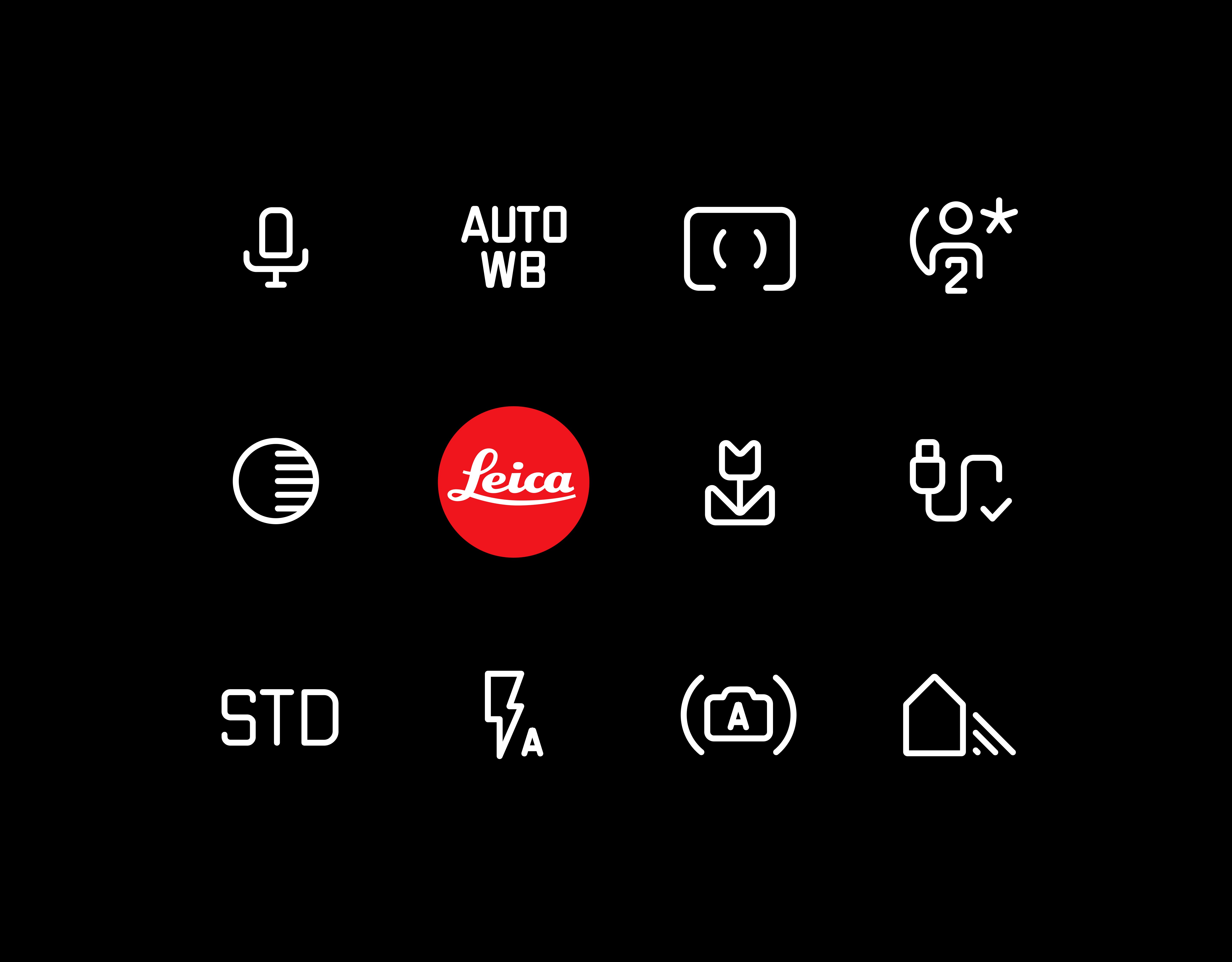
littlevoice modernized hundreds of icons used throughout Leica’s range of premium Leica Cameras (M, Q and SL) as well as the Leica FOTOS App to reflect Leica’s brand identity. The icons had to embody Leica’s principle and passion for concentrating on the essentials: Das Wesentliche. This meant the icons had to be easy to understand and intuitive to use; allowing photographers to concentrate on taking better photos without having to battle with trying to understand what function the icons represent. This was challenging as many of the icons represented technical features with no obvious metaphor or visual representation.
The modernised icons had to balance Leica’s brand identity, with practicality and usability. The legacy icons were a set of technical icons, created in different styles over the years with no consistent brand identity. The modernised icons reflected Leica’s brand with its legendary 'class of its own' reputation. The icons also shared a common language making them completely recognizable and memorable across different Leica cameras and the App. They were practical, useable and relevant because they were purpose made to clearly communicate on the very small screen of a camera where the attention needs to be on the photo rather than on icons.
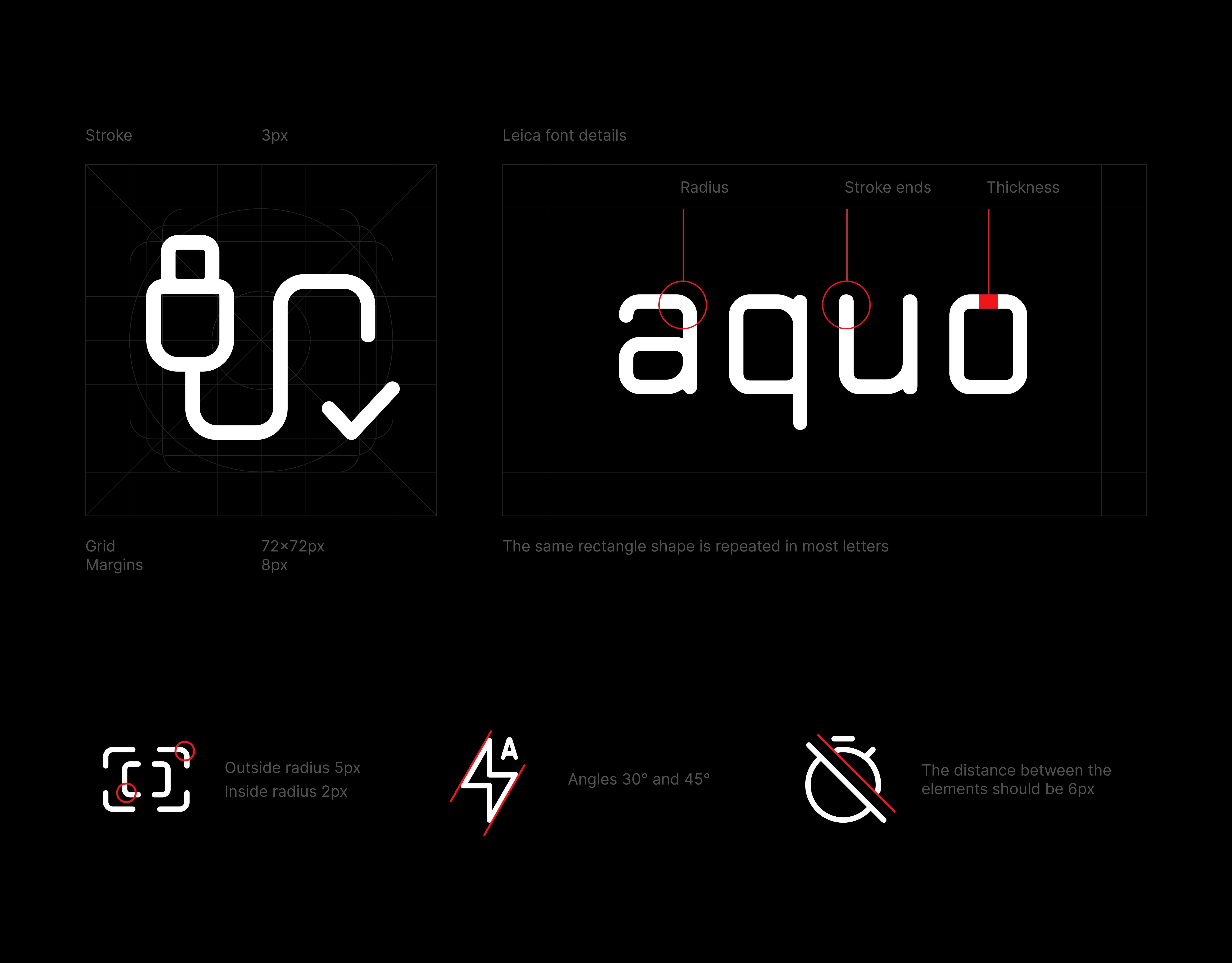
The look and feel of the icons was heavily influenced by the Leica font; initially created for etching directly onto camera metal and later digitised for use in UI. The font used in this icon set was made current to create a sense of approachability, ease and simplicity. The icon language is unintimidating and its simplicity/intuitiveness embodies Leica’s principle of Das Wesentliche. This was achieved using the optimal size for the target screen. The margins were maintained for the optimal balance of empty space and icon content. The vector graphics were drawn for scalability. The stroke thickness/radius was selected to match the Leica font.
Leica is a strong brand that heavily relies on its custom typography. The new icon set serves as an extension of the Leica font, in that is uses a consistent style. It unifies the visual language of the industrial design (etched on the camera body) with the on-screen experience. It simplifies the use of the camera. Over time Leica cameras grow in features and complexity. By using a consistent and simplified visual language, the complexity is more manageable.
Leica’s design language is associated with the brand’s long tradition of excellent quality and craftsmanship. By evolving and strengthening Leica’s design language through this modernised icon set we are keeping Leica’s heritage alive for its aficionados as well as for new generations of photographers. Rather than reinventing the icon wheel and introducing new and unusual icon forms, we have stuck with an icon language of simplicity and heritage. This can be harder to attain than novelty but ultimately assures product longevity and therefore increases sustainability.
littlevoice brings a rare mix of digital and industrial design expertise. They understand how hardware and software come together and turn that into a seamless Leica experience. They read our brand, shape our products, and help us understand who we are building for. They feel like an extension of our team and often understand the work even better than some people internally.

Mark Shippard
Head of Design at Leica Camera AG
